Say what it is about, in one sentence
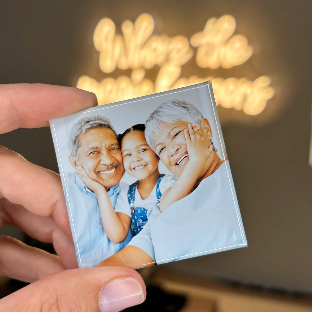
Before touching any design tool, finish this sentence: this magnet is about ___. A rescued greyhound. The week the kitchen was half-built. Grandad holding a baby who is now taller than him. That single line decides what belongs in frame and what gets cropped away. Designs go wrong when somebody tries to compress a whole year onto one small rectangle, and no amount of clever layout rescues a piece that never knew what it was for.
Point the details at a person
There is an easy default when personalizing something, which is to reach for the occasion: a birthday, an anniversary, a date on a calendar. The pieces people actually keep go further and point at the relationship instead. Something made for a brother two thousand miles away might lean on places you both remember from childhood. Something for a new grandparent might gather the faces they miss between visits. Ask what this particular person would want to catch sight of on a Tuesday morning, then pick frames that answer it.
Words earn their place or they go
Text is part of customizing, not decoration. A first name, a year, a place name, or three well-chosen words can lift a good photograph into something pointed, and it genuinely helps when a household is keeping track of several children or grandchildren. Past that, restraint wins. A full sentence squeezes the type down, competes with the face, and somehow reads as less personal rather than more. Anything longer belongs in the note that travels with the parcel, where there is room to say it properly.
Decide whether the picture or the message leads
Broadly there are two designs: a photograph you want looked at often, and a graphic carrying a name, a date, or a short message. Attempting both at full volume crowds everything. Pick which one leads and let the other sit quietly underneath. A reception photograph with names tucked into a corner reads cleanly at arm's length. A layout stuffed with type around a postage-stamp image reads like a flyer, and flyers get recycled.
Repetition is what makes a batch look intentional
Once an order runs past a dozen, consistency does the heavy lifting. One palette, one layout, one type family across every piece, so a tableful reads as a single identity rather than a pile of separate attempts. A coordinated run looks planned even when the individual photographs vary wildly. A mix of one-off designs looks last-minute even when each piece is perfectly nice on its own. Settle the look once, then stop redesigning.
Check it small, then order spares
Every design decision above collapses into one test: shrink the artwork until it is roughly credit-card sized and see whether the subject survives. If a face dissolves into background at that scale, crop harder or pick another frame, because the printed piece will not be more generous than your screen was. When the set is settled you can order through our print partner, and it is worth adding a couple of spares, since relatives who spot them on a door tend to ask for their own.